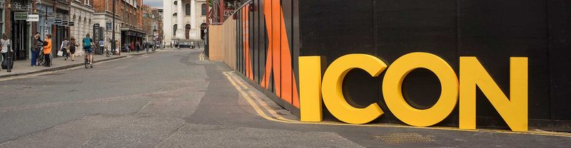
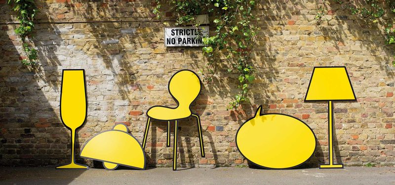
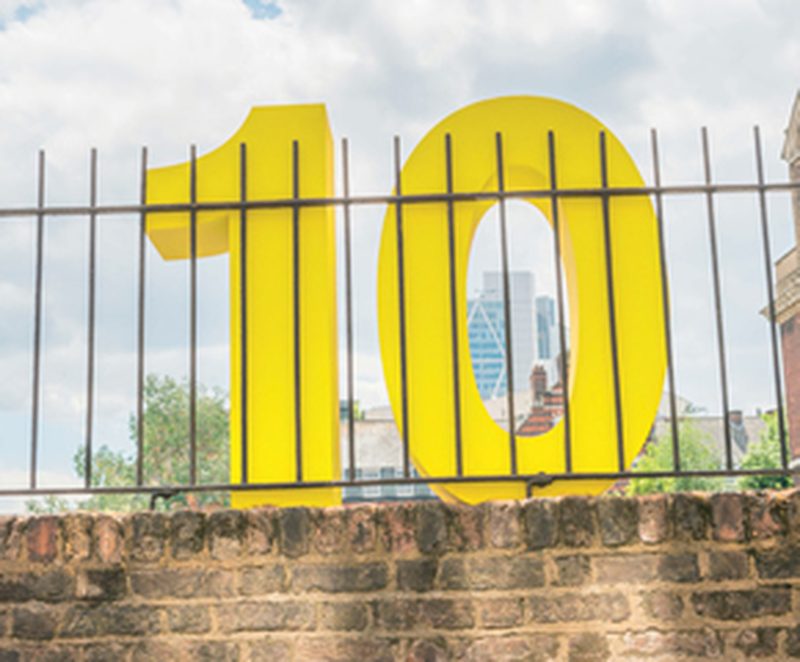
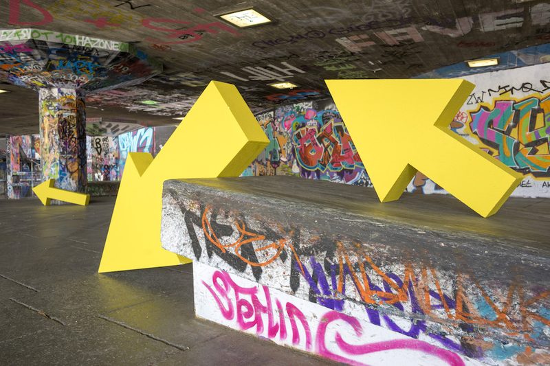
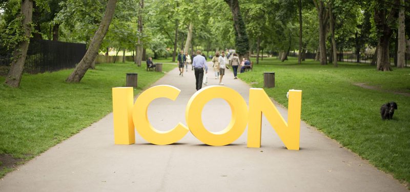
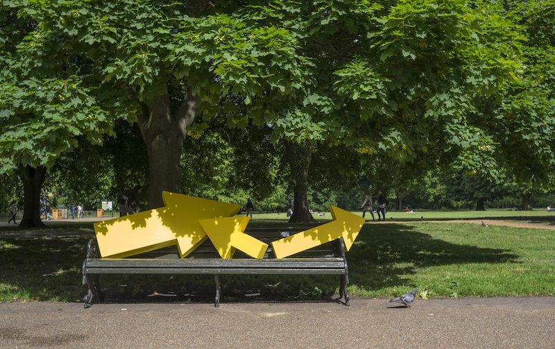
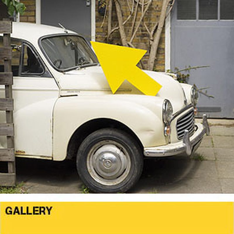
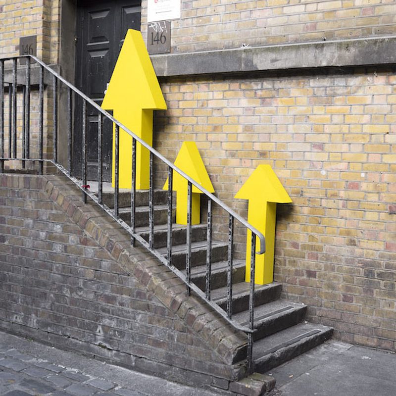
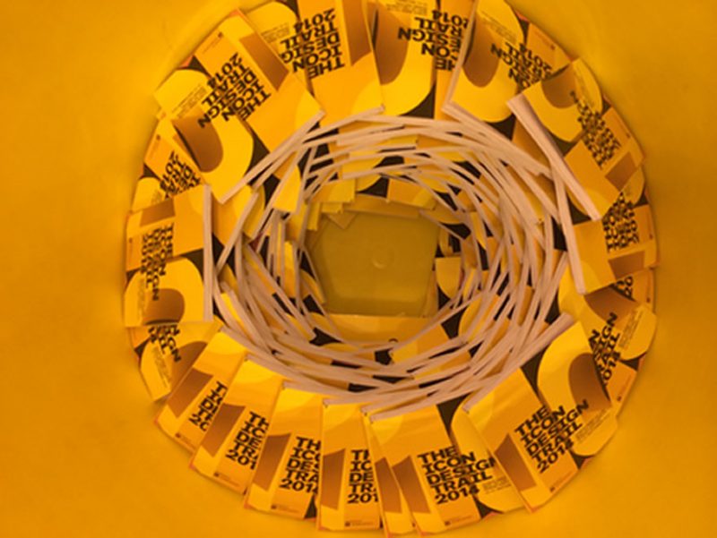
The gallery at Icon Design Trail gathers visual memories from across the London Design Festival, giving visitors a rich sense of the exhibitions, installations and showcases that have filled participating venues. Rather than a purely promotional space, it reads as a curated record: images of furniture, lighting, textiles and technology arranged with the same editorial care the guide applies to its written recommendations. Photographic bands carry the page, letting full-bleed imagery do the talking while the serif typography stays reserved for short, thoughtful captions.
As a highly influential guide that features only the best events and shows during the festival, Icon Design Trail extends that curatorial approach into its picture-led content. The gallery invites editors and visitors alike to browse a wide array of creative industries, from interior brands and cutting-edge showrooms to independent studios and anniversary showcases, all captured in a warm, human-centred visual style. Hands, materials and people are photographed closely, mirroring the guide's belief that design is best understood through the objects people actually touch.
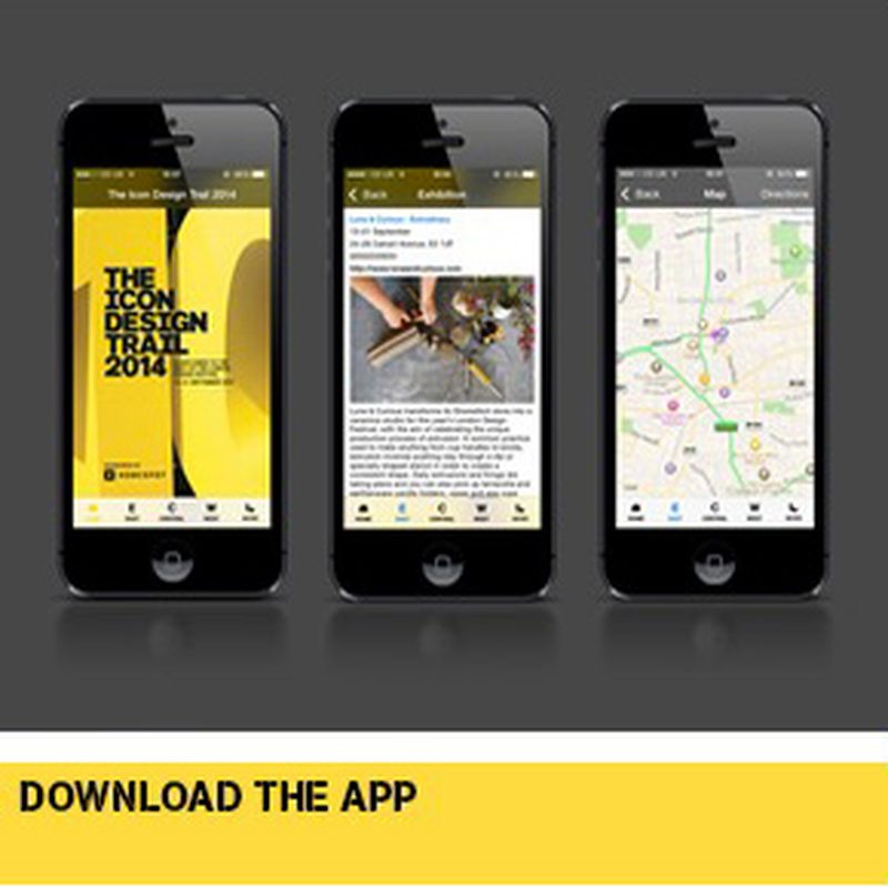
The gallery page also functions as a practical companion for anyone planning a day out during the festival. Because the trail is compact and packed with participating exhibitors, images of individual stands and installations help visitors build a mental route between venues before travelling. It reflects the guide's ongoing effort to bring visitors to talks, exhibitions and events that reward attention, and to recommend participating exhibitors whose work deserves a second look rather than a hurried glance.
Beyond the current edition, the gallery plays a subtle part in the guide's history. Icon Design Trail has run for many years, supporting exhibitors, sponsoring events and celebrating the designers who shape the London design calendar. A living image archive reinforces that continuity, showing how the character of the festival shifts from year to year while the commitment to celebrating exhibitions, creative thinking and the industry's leading voices remains constant and dependable.
Editorial care defines every element of the gallery, from the pacing of images to the generous white space that surrounds them. Soft blush-pink panels frame content cards, and deep magenta accents mark the small, solid buttons that lead onward into further festival details. The result feels less like a commercial showroom and more like a printed magazine spread: considered, warm and reflective, encouraging readers to linger over the work, remember the trail and plan where to visit next.